Sunday, 31 May 2009

Pop Culture Thumbs-Up - 31/05/09


   This is Karen Gillan, the first companion for the Eleventh Doctor in next year's all-new Doctor Who series. I approve. I can imagine the trickle of information increasing over the summer to maintain interest in the remaining specials and beyond

   Hickey A/W09, via A Continuous Lean - worth a glance to see one of the most striking Sartorialist subjects take the stage as Hickey's mannequin

   Much as I maintain a healthy disinterest in Britain's Got Talent, I must approve of the winners - who doesn't love a dance crew?

   Observant as ever, Bill Cunningham does one of his sporadic weigh-ins on NYC men's outfits in a slideshow entitled 'Boundless.' In the microcosm of the world's cultural capital, dressing up is king

   "I'm extravagant in ways that relate to my heritage" - celebrated man of letters Gay Talese on his love affair with suiting. It truly is all in the details. If that quote does not become his epitaph - I'm sure he's said better - then I'd like it to be mine

   UK-specific - Sky1 stealthily nabbed House season 5 whilst Channel 5 was procrastinating and episode one went out earlier tonight. It's an uneven season, but stick with it - the highs are as emotive and hilarious and thought-provoking as ever, and if you're at all emotionally invested in the Damaged Doctor, the finale just might crack your heart

   Late addendum: Eminem vs. Bruno. Nothing distracts from the ills of the world like a gross-out moment on national TV that will probably lead to a major vendetta (as long as it really was unscripted, of course. Which it wasn't)

    Pointless note: the last entry in this column was on the 13th. How palindromic

The Sun is My Enemy


   I like the brightness and the length of the days. I just don't deal as well with the heat (more or less what I expressed the last time the weather improved). "Elegance is harder to maintain in the summer" is a truism that someone needs to print onto a t-shirt. Speaking of upper halfwear, I'm wearing the H&M TREND(Y) shirt I wrote of some time ago. It may inspire the shortest 'Customise Me' post ever once I've changed the position of the collar's buttons

   The title of the post was borrowed from a song by my musical idol, Cornelius, who more than likely borrowed it from the book by Henrietta Aladjem. Because of familiarity I can recommend the one, and because it seems fitting somehow, I may as well recommend the other. I hope that whoever's reading enjoyed their weekend


In fairness, the evenings are still cool enough for a little layering. Everyone's a winner, baby

Thursday, 28 May 2009

The Bow Tie Post (A Primer)

It's time


  Truth is, the bow tie just seems incapable of dying, no matter how far out of favour it's fallen as daywear. Even if half the attendees at a black or white tie event can only put together a clip-on-centric ensemble, they still have to wear the curious little thing (and note that the Oscar attendees who haven't succumbed to the silk black necktie opt-out in favour of tradition are the ones who draw the most sartorial praise, or perhaps the least ire). Even if treated as costume, my jaunt to Prohibition, and my subsequent uncovering of related events such as next week's The Blitz, proved that some men will pay attention to such details

   Meanwhile, on American television, Chuck Bass runs amok, barely tamed by the show's stylist, and dorky, baby-faced Harry of Mad Men somehow adds to the drama's cool and influential allure (and his own need for maturity) by wearing his BT like it's the most natural thing in the world (and though its decline was setting in even back then, playing such an affectation straight makes all the difference in its perception). And outside of the box and all over the country, Southern, WASP, Trad and older gentlemen are working with these fictional constructs to subliminally influence the male metropolitan young in broadening its look

   And then there's the geek chic thing. For comparison's sake, imagine a small-scale style version of the image makeover Sony gave to video game players when the PlayStation first emerged. Introduce, say, four more male sex symbols wearing these adornments on a regular basis and widespread popularity just might ensue

  It would be remiss not to credit the designers who are unable to let a good thing die. Dolce & Gabbana, Valentino, Yves Saint Laurent, Junya Watanabe (briefly), and especially Ralph Lauren and Tom Ford - all have produced collections that feature the bow as part of an affectionate tribute to old world glamour, rather than as a rehabilitative stylistic exercise. Understanding and insight into tradition and elegance is the secret weapon of the man who wears a bow tie well; it's what separates him from the hipster method, which is usually so much ironic, style unconscious pap

   To whit - a bow tie on a polo shirt is a geek's game. It really, really helps if you are an actual geek, or at the very least, an indie kid with geek affectations. Otherwise, it's a look perpetrated by one who self-consciously doesn't know what he's doing, probably because he's aping someone else in the first place. To make matters worse, the polo will more often than not be clashing with the clip-on in the first place. And it would really help if arbiters whom I trust to know better would refrain from encouraging the impressionable

   The BT + plaid shirt take isn't much better. Plaids are a particularly strong pattern and tying up the collar with a BT seems even more contrived, like trying to contain a fit-to-burst balloon of colour and pattern with a non-complementary string. About the best ways to minimise and refine the look are to wear a relatively less bold shirt, use a bow tie that harmonises with the colours of the shirt (so it's best to keep the BT plain and perhaps in a more luxe material such as silk) and wear a sober, well-cut sportsjacket or knit v-neck, both of which always balance out more exuberant shirting


   But really, my point is this: it's not a Herculean undertaking to wear a bow tie in this day and age. Sobriety and subtlety are the key and the bolder models will be mastered with time and confidence. BTs have been denigrated as flamboyant for decades but there's little flamboyant about their use amongst traditionalists, who team them with otherwise plain, neat ensembles, and it's this sort of principle that should guide their use - no pushed up jacket sleeves or untucked shirts or daft clip-on braces

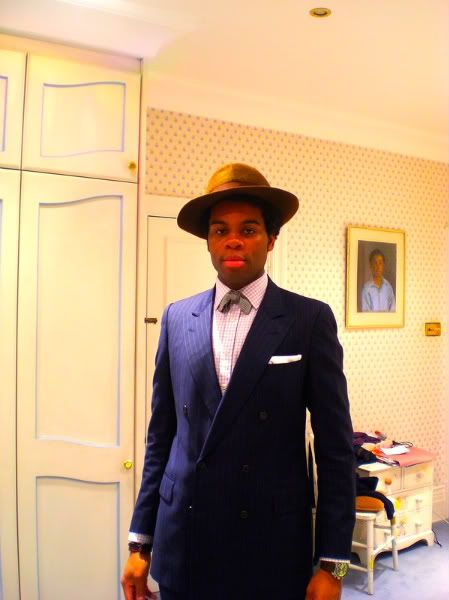
   A bow tie is a creative piece and should be treated as the most idiosyncratic item in an ensemble. With a suit, the pocket square should be fairly tame or folded, and the shirt pattern can be reasonably discreet - too loud and it's off to clown school. I myself have worn far more ridiculous items than BTs, and on my rambles in the less fashionable areas of South London, the bows have attracted far less scepticism, scorn or sneers than my old graphic t-shirts and outlandish jackets. In fact, they've gone almost entirely unnoticed; quite the exhilarating feeling in truth. It's a simple matter of making the surrounding garments calmer, or, conversely, as interesting

   Anyone can see that one is wearing a bow tie, but you'll suffer if you feel the need to draw attention to it by, say, selecting an awkward silhouette of drainpipe jeans and an overlarge jacket or a full-bore Victorian ensemble. Wear it in good taste and a compliment or two might be forthcoming - particularly from women - with bonus points awarded for self-tying. Wear it like a clown and any negative response is really on your own head


Dsquared2 A/W06: clownish might be too harsh in this case. In the real world, shedding the topper, pulling up the trousers, shrinking the sleeves and detaching the fob chain from the fly would make this look hard to argue against


Lanvin A/W06: The first outing under the Lucas Ossendrijver/Alber Elbaz creative wing presented a realistic hypothesis of modern bow tie wearing, based principally on a slick high school senior's approach to eveningwear. All the colours are neutral and solid; most of them dark. The cropped trench ably substitutes for a double breasted jacket, the silhouette is relaxed and worn, and the gloves support both the formality and casual practicality of the look. The shapes allow the trainers to blend in. The bow tie is a little out of proportion with the model's face, but keep the widths and height restrained and this won't be an issue

   The best bow ties tend to be British-retailed - excuse my bias - or from Ralph Lauren. The most attractive and varied ones at the moment are available from the old standby likes of Hackett, Turnbull & Asser and Budd, while Brooks Brothers, RL and Tom Ford (who else?) take care of business on the American end. More affordable products abound at Woods of Shropshire, Clermont Direct and eBay. And if there's anyone I've missed, do let me know - I'd be more than happy to wear them


Runway images: men.style.com

Sunday, 24 May 2009

Spring's Last Swing

   As London heats up, there's one place I know I can rely on to layer up for at least another few days - Edinburgh. Bank Holidays should always be spent out of town if it can be helped. And this is one city I don't mind helping myself to

Day Version ('Til the Early Evening)


Night Version - Club Ready

Thursday, 21 May 2009

Customise Me: An Update


   Fiona and I spent a little bit of time planning the next phase of my garment "remixes." Most of the pieces are summery in construction and purpose, which suits me rather well - winter wools and layering are truly my forte, allowing me to work on my summer looks - but on the other hand, low expectations are mandatory for English weather

   Included are a sketch of a linen short sleeved shirt that will be patched with extra fabric along the arms, a display of Fi's workspace, and my obligatory outfit shot, which I thought rather suited this rare day of dryness and sun


   More as it develops

For previous entries, click the 'customisation' link below

Wednesday, 20 May 2009

A Homage to the Belowmentioned


   With a dash of John S. Goodall's An Edwardian Holiday

Tuesday, 19 May 2009

Junya Watanabe's Year of the Gentleman, Part One


   Anyone who's discussed clothing with me for more than 5 minutes of their time knows that at this particular moment in my life, Junya Watanabe Comme des Garçons Man is indisputably my favourite line of men's clothing. Let me extrapolate on that

   Around the time I first immersed myself in the online rabbit hole of style websites and the warrens of discussion forums, his name would often come attached with enough superlatives to make most other designers insecure for life. His interview with style writer Charlie Porter was the only reason I have purchased an issue of i-D magazine since my student days. His womenswear is justly more acclaimed, but nevertheless, he expertly produces four collections a year across both gender markets that intersect his visions of practicality for one and fantasy for the other with shared themes, prints and even cuts. And his influence on me is such that I've practically graduated to wearing a garment designed by him once a week

   But the ease in which I can integrate his designs into my aesthetic is one of many reasons that inspire my affection for his work. And I don't think that was any more apparent than when he debuted his Spring/Summer 2008 line, as well as its successor for Autumn/Winter. So, in the name of backwards logic, I'll start with the latter

   An admission - I don't own any pieces from the recently departed A/W08 line (yet). It was an engagingly dandified take on American Trad and varsity looks that perfectly exuded the credo of "a new feeling for basics" that concludes the manifesto on the transparent blue flexi card attached to each new piece (the card is a rather Japanese sentiment, much like their giving of gifts and instinct for amazing record packaging)

   Despite the notoriety of Thom Browne's alterations to the silhouette of tailored suits, the pervasively shorter image was an exploration undertaken by Watanabe as far back as 2003 when his A/W04 collection showed in Paris, which not only showed shrunken suiting, but also darted and cut away fabic at the points where the body's movement would take place within the suit (or joints and 'pits to the rest of us). And if there's one thing that Watanabe gets very right where Browne can falter, it's in making this shorter look seem appropriate and wearable, much more linked to the well-cut "bum freezer" jackets of the 60s and 70s than the slightly off-kilter boxiness or blood flow-constricting tightness of Browne's work (although I'm also aware that Browne's customers may choose not to emulate his infamous look)


   But this background knowledge makes for a good starting point to delve into the collection, as do the Browne comparisons. Usually, a Junya collection has a title, and although I didn't find an official one anywhere, Dover Street Market referred to it as "Junya Watanabe's Way of Dressing Up," which works for me. The overall look is smartened up, but there's a hint of mischief in jackets that include trim running along the hem and quarters, including a paisley pattern that debuted in the previous season

   The runway ensembles showed a look that was utterly gentlemanly and easily emulated if the proportions are correct - the rolled-up cuffs on the trouser bottoms easily balanced out the particularly short lengths of the jackets and allowed for an utterly daring, but fun, display of one's socks. This was where the show excelled, by bringing the Edwardian holidaygoer look into an archetype that took hold around 40 years later on an entirely different continent. Perhaps it was the use of such trad staples and silhouttes but for some reason, the rolled up look felt rather unique to this particular archetype and did not feel beholden to the aforementioned Edwardian look, nor to the greasers that also appeared during the 1950s. And whilst it's more of a nod to Watanabe's well-documented fondness for punk, the inclusion of porkpie and trilby hats and the shortened trousers added an element of idiosyncratic refinement into a look that usually utilised bold madras and checks to inject a playful element into its ensembles. In actual fact, the use of such patterns in Watanabe's colection was rather subdued, opting for duller compositions on cardigans as overall patterns or patch pockets, and also cut into panels and attached to the backs of shoulders and arms on recut Brooks Brothers shirts to inject a subtly whimsical element into them

   This whimsy continued with the backs of various jackets, trousers and even suits presenting a different aesthetic at the back - racing stripes, nylon tracksuiting, striped knitting and wool checks all appear as each garment is turned around. A sportier, collegiate image was represented by nylon and wool varsity jackets rejigged as sportscoats with leather sleeves that could still appeal to, and stand out with, a smarter look


   Whilst a lot of it appeals to my sense of fun, I believe that part of the reason I didn't gravitate to this collection as closely as I have to some of the others was due to the persistent sensation of the collection being gimmicky. Many of the pieces felt overly designed due to their double-sided construction, which made it difficult to find one's sense of self in wearing them. (Un)usually, Watanabe would get around this by using a more subtle form of hybridisation, merging two disparate pieces such as a military jacket and a blazer into one by adding the details of the former to the shape of the shape of the latter, or presenting a biker jacket in bright, boiled wool instead of leather. This season was less exploratory in that respect, opting to display sartorial quirks and fabric choices rather than the subtle insights of the designer that has allowed him to put fresh-yet-mostly-restrained spins on traditional pieces in a way that is unmatched by any other

   It's not a good feeling to realise that a Watanabe item could effectively be bought elsewhere from other brands - repp ties are available from various outlets, even moreso if you attended public/prep/private school or a top tier college - and while it easily stood apart from the inevitable Browne comparisons due to the injection of its own ideas, the collection did not quite create "a new feeling" for tradition - if anything, it felt greatly beholden to the past


   Nevertheless, there were some great ideas to be found when Watanabe's instinct for cross-pollination took hold. Workwear met suiting with hammer loops and nail pockets on smart trousers, the leather sleeves of the aforementioned varsity sportsjackets appeared on Gloverall duffel coats that were actually from the boy's collection, and trousers were constructed in a jean factory and triple-stitched accordingly. But these sorts of ideas were elementary for a Watanabe collection, and what I consider to be his best work will certainly be analysed in future entries


Monday, 18 May 2009

Stop and Stare - Dan Perjovschi, Finsbury Square


   Until recently, I worked in the hub of London's financial centre known to all as The City, where I plied a trade for 3 years as a researcher, marketer, copywriter and creator of promotional literature. And walking through it last night was a pensively unsettling experience, broken up with thoughts of slight (and possibly unwarranted) schadenfreude for the "suits" who were in for work on a Sunday

   But I did not envy them entirely. I missed the feeling of a more structured flow to the day (excepting that my work was broad, ad hoc and fraught with negotiation for the littlest things); of being ensconced in Central London week in, week out; of getting to wear a suit daily. Yet I don't miss the industry. And I hope for a new one to immerse myself in soon

   But the Square Mile does have its highlights, and one in particular caught me as I ambled through Finsbury Square. The windows were artfully scribbled on with searching slogans, messages and scattered thoughts by the Romanian artist Dan Perjovschi, who, along with Croatian-born artist Jadranka Kosorcic, makes up COMMA 05, and COMMA 06, respectively, of Bloomberg SPACE's COMMA series of contemporary art exhibitions. The ethos behind COMMA is to give a space and free reign to selected international talent to produce new work that will channel the inspiration of their surroundings, while naturally finding a new audience as a result

   Kosorcic, gifted in minimalistic expressionist sketches, created a series of portraits of subjects sourced through Bloomberg's internal messaging system, previously better known for exchanging gossip, mulling over rumours and discovering inside information. Combining cartoons, Basquiat-esque graffiti and crude scrawling, Perjovschi took his influences from current political, social and cultural concerns and voices them directly in a manner that could be considered self-incriminatory where The City is concerned, adding new drawings as the run continues, so to remain as close to the issues as possible

   The display of his art in the front windows of SPACE was a distracting, and welcoming, sight. Indeed, its bare bones aesthetic seemed to merge perfectly with the austere, stark glass-stone-and-steel construction of its temporary home


   COMMA 05 and 06 will run until Saturday 23rd May


Friday, 15 May 2009

Outfit Digest - Hair Loss


Before:


After:


It happens to us all

ShareThis